
Now is the Time to Build Your Course Brand
It’s time to play the memory game. I want you to close your eyes….wait, that won’t work…okay, as you are reading, I want you to picture yourself as an 18-year-old college student getting ready for your first day of college. It’s the night before your first class and you are checking your backpack to be sure you have all the necessary school supplies, you check the alarm clock to be sure it is set for the correct time, you then decided to login to your school’s website to access the courses documents you may need prior to the first day of class. When you login you see this:
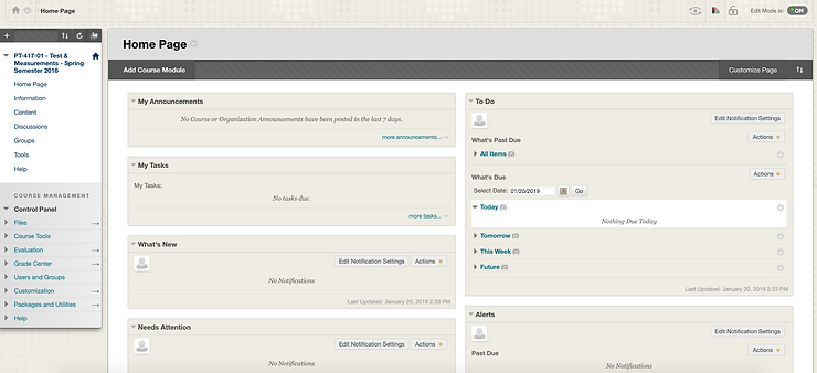
Where would you click first to find the syllabus? Is this a bit overwhelming to you? Would you find yourself saying, well, maybe I’ll wait until tomorrow to see if the professor passes out a copy of the syllabus? How does it make you feel? What does it make you think about the professor? Could you possibly think, oh great, my professor doesn’t even know how to setup their classroom webpage….they must be ancient! Or this professor doesn’t even care about their course, so why should I? Some of those questions may seem a bit extreme or dramatic, but I don’t think they are too far off of what our students think when they see these generic webpages or syllabi.
Let’s flip the scenario…okay, so you are 18 again and back logging into your course’s webpage and this is what you see instead:
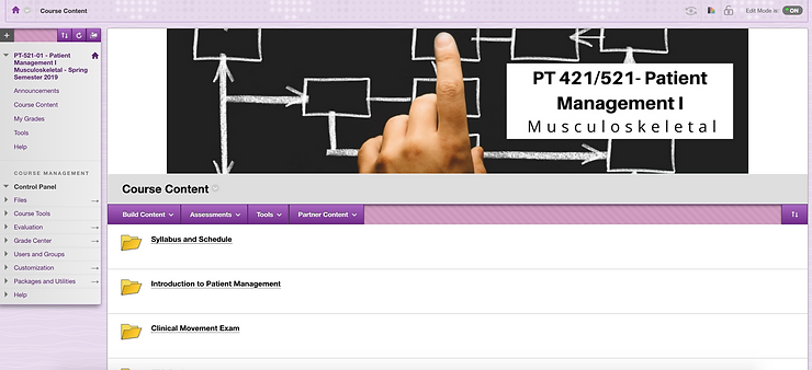
Can you find where the syllabus and schedule are at now? How does this webpage make you feel? Does it communicate something different? If you said it didn’t then I wouldn’t read much further, but if you said it did then let’s get started!
Branding your course is an excellent investment of your time. Good design affects your emotions and your perceptions. It also communicates care and credibility. When you see a professor has taken the time to invest in creating an aesthetically appealing platform, you will automatically think, “WOW, they must really care about this.” It stands out, which means it communicates a message of care to your students. They will come into your course with great expectations because you took the time to invest on the front end. According to webpage design research, it only takes viewers 3.42 seconds to make a significant judgement of credibility of a product. If we apply this to education, then we do not have a second chance at a first impression. Let’s build your first impression together by following these three steps:

1. Choose a photo that tells a story.
Photos are a way we can communicate emotion. When our students are interacting with our course content, we want them to be engaged and just as passionate about the topic as we are. How do they know they know we are passionate about the topic before the course even starts? We communicate that through our brand which includes a meaningful picture. Photos tell a story, which as I said in Antidote #2: Using a Superpower, storytelling is one of our best super powers. The key to choosing a photo lies in making sure you choose a really clear photo. If you are like most of us, you probably aren’t a photographer or excel at altering pictures in photoshop. Don’t worry! Here are three places you can find royalty free stock photos that are clear and will help you communicate your message: www.pexels.com, www.pixabay.com, www.flickr.com
2. Choose eye catching and appealing colors.
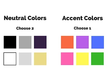
When you think about Target, what color do you think of? Red? Of course. When you think of The Home Depot you think of their orange aprons, right? Colors are a powerful retention tool. They create an additional link to information that helps your memory store whatever it is you are storing, even if it is useless information. We know our information isn’t useless, so even more of a reason to utilize colors in your brand. When you are choosing colors for your course brand, stick to 2-4 colors at the most with 2 of the colors being neutral and at least 1 accent color. You can use the accent color to emphasize content. That subtle change in color creates another way for your students to link the material in their head in order to retain for another time.
3. Choose easy to read fonts.
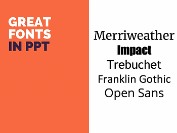
No one has ever said you have to stick with the default font that opens up with PowerPoint. I’m not saying anything is wrong with Calbri, but I am saying you can choose better. And if you are still using Times New Roman…let’s make a pact to never use it again. Times New Roman is considered a serif font, which adds little lines to the edges of the letters for decorative embellishments. Those decorative embellishments limit readability, and rule number one about choosing your font is that READABILITY IS MOST IMPORTANT. Sans-serif fonts are easier to read in print or on a screen. When choosing your brand’s font, choose 1 to 2 fonts. It is okay to fluctuate back and forth, it also is a way to create contrast which will emphasize something you want to say. Some good sans-serif fonts to check out are Merriweather, Impact, Trebuchet, Franklin Gothic or Open Sans. If you want to get really creative, you can download lots of different fonts for free at the following webpages: www.dafont.com, www.fontsquirrel.com, www.fontspace.com
Whether you are a professor in charge of a whole course or if you are a clinician just giving a presentation, I challenge you to brand it. It will communicate the passion you have for your topic and your audience will take notice.
What ways have you branded your courses or presentations?